
Adding Understanding To Raw Data: 2 Six Sigma Analysis Examples
By Steven Zebovitz, R.Ph., Ch.E.

In my three previous articles, I introduced Six Sigma as the DMAIC roadmap. The steps along the way are Define, Measure, Analyze, Improve, and Control. In the Define stage, we learned about the project definition with its internal and external roles. In the Measure stage, we learned about variable types, the data collection phase, and data accuracy.
Up to this point, the Six Sigma team has collected raw data. Through the processes of brainstorming, failure mode and effects analysis (FMEA), input/output variables matrix, and other techniques inclusive of all job functions, we’ve whittled down the number of raw-data variables, but raw data provides no process understandings. We don’t know how input variables (the X’s) affect output variables (the Y’s). So, we don’t know the effect of input variation on our outputs. To gain these understandings, we apply statistical techniques to the raw data. We track, trend, and draw correlations based on our project definition.
The goal of the Analysis phase is to determine which input variables have the predominate effect on output variables established earlier in the Define phase. By improving these variables through tightened specifications, altering process condition, equipment maintenance, etc., one achieves the goals of the project definition. By controlling the variables through tightened specifications, automation, training, enhanced procedures, etc., we complete our project definition.
A Cautionary Note
The Analyze phase will, in part, generate correlations proclaiming that an output is based on certain inputs. Sometimes this is correct, but sometimes correlations are happenstance. As you move through Six Sigma, always remember the mantra:
Correlation ≠ Causation
A correlation must be proved to be determined causative (or there must be compelling evidence to declare it proven). Correlations are validated through methodical experimentation, or design of experiments (DoE), which I will briefly touch upon later in this article. Without an executed DoE, the Six Sigma team has no understanding on which to base decisions.
A Note About Software
A number of software vendors provide excellent products. In my experience in the pharmaceutical industry, JMP and Minitab are the most commonly used. Also, Excel has an Analysis Toolpak add-in that covers much of the Six Sigma needs.
I am most familiar with JMP, and through the flexibility of SAS, I will use its sample data and screenshots for the examples.
Analysis Techniques of Six Sigma
This is the broadest topic of the DMAIC roadmap, and I will barely scratch the surface. Techniques applied must consider the goal of the project definition, the type of data (discrete vs. continuous), and the quality of the data itself. For purposes of this Six Sigma introduction, I’ll use continuous data. Remember that the goal of this step is to correlate process outputs as a function of process inputs: Y = f(x1, x2, x3, …).
Analyses fall into two main categories. descriptive statistics draw correlations from existing data, and the resulting correlations are limited to data ranges. Inferential statistics use probability theory to draw correlations of entire populations beyond the data ranges.
Six Sigma uses descriptive statistics, which fall into two main categories:
- Measures of central tendency, encompassing the mean, median, and mode (the most frequent value in a data set)
- Measures of dispersion, encompassing standard deviation, minimum values, maximum values, quantiles, and shape of the distribution curves
From descriptive statistics, it’s possible to gain deep understandings into data.
Analysis techniques are numerous and are a study unto themselves. For purposes of this introduction, I’ll provide examples of two frequently-used techniques: capabilities and regressions.
Example 1: Capability Index
For this example, the JMP sample file Diameter.JMP is used. This data file contains 240 measurements across two phases (ostensibly after an intervention) and four different operators operating three different machines. Only averages of six measurements are plotted. Presumably, the operators and machines are equivalent, but let’s see. Recall that raw materials and machines contribute the most to variability, so in addition to looking at the process performance, we can do further diagnostic work.
Capability assesses a process relative to its specification criteria.1 It’s driven by the mean and the spread of the data as mentioned above, and variation is the key driver. Variation comes from:
- Inherent process variation is common cause variation, which is typical and expected.
- Total process capability is due to common and special cause variability.
- Process capability measures the inherent (common cause) dispersion of data compared to its control limits.
- Process Performance is the process total variation.
The short-term capability index measures variability within a subgroup, say, within a single batch. 2 Long-term capability measures capability across many batches.
Often, the process capability uses the criteria of 1.33 or higher. For highly critical processes, process capabilities of 1.67 or higher are used.3 These criteria mean that the data distribution curve fits within its lower and upper control limits with a 33% of 67% margin, respectively.
Capability indicies require data to have a roughly normal distribution. Distributions can be shown in the typical bell-shaped curve or in a normal quantile plot, as follows:4
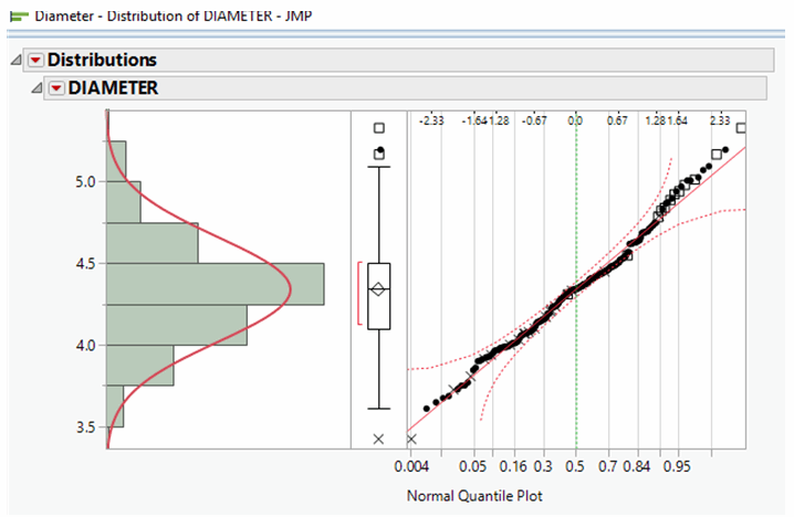
In the normal quantile plot, a linear correlation coefficient of 0.7 or better indicates a normal distribution. Hence, this data falls into a normal distribution.
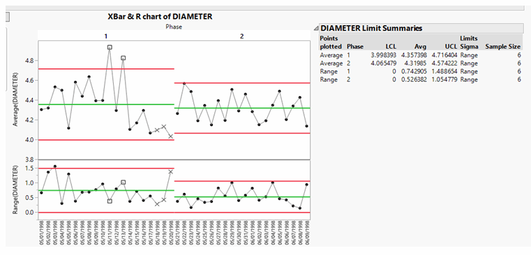
Let’s look at a control chart format. The data is phased into two groups, each generating a mean and lower control limit (LCL) and upper control limit (UCL). The upper chart is of the actual averages of six data points. The second plot is the “moving range,” the difference between adjacent data averages. Calculated to the right is an LCL of 3.99 and a UCL of 4.71. As both are above 1.33, the process is considered in control, but note that two averages in Phase 1 are above the UCL.
So, what happened to those two averages? Referring to the data table, we see that both high averages were the combination of an operator whose initials are RMM using machine A455. So, is the operator at fault, or was the machine at fault? Let’s use the distribution data and highlight each. First, let’s look at operator RMM in the Phase 1 data only:
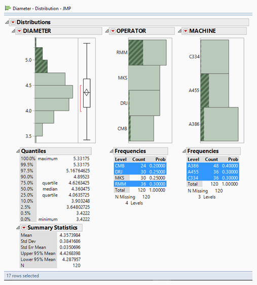
Phase 1 diameters above 4.75mm (i.e., above the UCL) are highlighted, containing 17 individual measurements shown in the above distributions. Operator RMM and machine A455 are the most common, but operators DRJ and CMB and machine A386 are also found. In other words, with this level of analysis, we cannot determine a root cause. In other words, it’s complicated. More investigation is needed.
Example 2: Regressions
The JMP data file entitled Nor.JMP is used for this example. It contains 16 rows of data comparing X to Y. Either two or three measurements are taken at each of the six sampling intervals.
Let’s derive a simple, general correlation from the data. It looks like this:
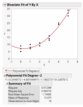
It appears we have an excellent fit and that the data can be modeled by a standard, quadratic function with a correlation coefficient of 97%.
But is the correlation real? Please recall that:
Correlation ≠ Causation
The Six Sigma team must ask if the process and situation have compelling evidence to suggest whether the correlation is valid. Quite possibly, the X’s and Y’s are unrelated trends that happen to give this correlation.
One technique might help separate whether the correlation is happenstance. Residuals are differences between actual data and the results predicted by the model. In this case, does the quadratic model of Y = f(x) actually have some repeatable pattern? So, let’s plot the predicted values of Y to the Residuals of Y correlation to see if a pattern emerges:
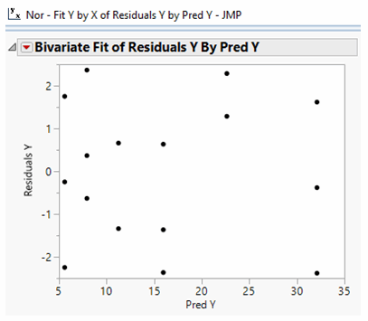
In fact, no discernable pattern exists. We may move further through our analysis with an appreciation that the regression is not an artifact.
Closing Comments
I began this fourth installment of my Six Sigma article series with the comment that analysis techniques go far and wide. In this simple introduction, I've presented two basic examples that capture but a small fraction of analytical techniques.
And as I’ve mentioned before, if you do not have your Six Sigma credentials, I hope you’ll find a suitable program and mentor — both you and your employer will benefit.
References:
- Breyfogle, III, F.W., Implementing Six Sigma, p. 186, John Wiley & Sons, 1999.
- , p. 170.
- George, M.L., et al, The Lean Six Sigma Pocket Tool Book, p. 139, McGraw-Hill, 2005.
- JMP V12.2 Sample data, Diameter data file
Acknowledgements:
The author thanks his Six Sigma teacher and mentor, Joseph Ficalora (joeficvfr@yahoo.com, 973-727-3788) for his critique of this manuscript. Mr. Ficalora is a Lean Six Sigma Master Black Belt and deployment coach. The author also thanks Joseph Owens (jpomedia1@gmail.com) for his editorial review of this manuscript.
About the Author:
 Steven Zebovitz, R.Ph., Ch.E., has three decades of pharmaceutical engineering and manufacturing experience in oral solid dose. Much of his experience is in engineering and manufacturing support, including leadership positions in technology transfer, technical services, process scale-up, validation (PV and CV), and optimization. He led a Six Sigma deployment that yielded 10 Black Belts and one Master Black Belt. His interests include process excellence, lean manufacturing, and championing teams. He may be reached at stevenzebovitz@comcast.net, www.linkedin.com/in/stevenzebovitz/, or 215-704-7629.